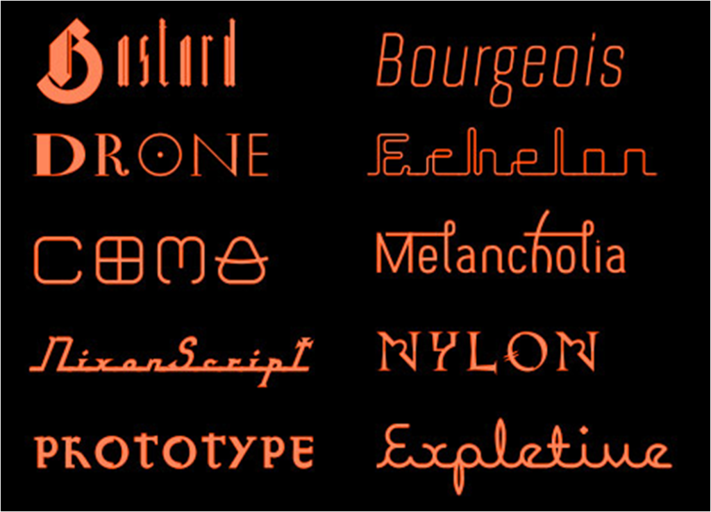
Jonathan Barnbrook (born 1966), is a British graphic designer, film maker and typographer. Currently, he runs his own studio Barnbrook Design which he founded in 1990. He attended the Royal College of Art in London from where he graduated with distinction. He has become a multifaceted practitioner of graphic design, typeface design, motion graphics, activism and industrial design. He introduced his typefaces through the California innovator Émigré and his widely known typeface Mason appeared in 2010. The typeface became one of the first digital acquisitions of The Museum of Modern Art.
His design identity has been characterized as a mixture of idealism and cynicism, irony and self-deprecatory humour. Committed to innovation in type use, Barnbrook pioneered new ways of incorporating type on film title sequences by using stop-frame animation His noted typefaces are Prototype, Exocet, Mason, Mason Sans etc. Barnbrook’s graphic designs follow a recurring thematic pattern based on his personal responses to political events. His inner anger is his response to all the unfairness that is in this world driven his work. Barnbroonk set it as his goal in life to use his talent of graphic designing as a weapon for social change and justice.
visual identity for the 2010 Biennale of Sydney in Australia.
Neville Brody (1957) is a British Graphic Designer, Typographer and Art Director currently working in his own design practice called Research Studios. In the early 1980s Neville Brody contributed to a defining moment in British graphic design. He may be best known for his work on ‘The Face’ magazine and various album covers, but he’s also a leading typographer and internationally recognized brand strategist. He is known for his highly innovative ideas on incorporating and combining typefaces into design.
Brody considered that the typography should be an integral part of the whole design and be given equal importance. The style of lettering should be used to illustrate the article as well as the image or photo and have the same impact. Brody represented a mix of fashion, graphics, music and style culture. He re-energized graphic design by bringing together, in a new way, sources from the edges of youth style and commercial culture. An important part of Brody’s innovation was to turn to street style as a source for design.
For more than six years Brody worked as art editor of The Face, the new style and culture magazine launched in 1980. There his work collapsed the conventional distinction between typeface and graphic symbol. Sometimes with the aid of the computer, but more often by hand, Brody devised many new alphabets for the headlines of the magazine’s articles. Instead of offering immediate legibility, these designs intrigued the reader with a contemporary, nuanced feel that has been described as a set of “eccentric mannerisms”.
Brody was an important figure in the promotion of ideas about digital typography. He published the digitized magazine Fuse and played a key role in the design field.
Brand Strategy for Nike – Designed in 1988
To highlight the most interesting parts of an article and to attract the attention of the reader, he used contrasting sizes, shapes or colours of type.
Free Me From Freedom – Poster Designed in 2008
“Typography is a hidden tool of manipulation within society.”– Brody
“The way something is presented is the way you react to it”– Brody
Andy Warhol (1928-1987) was an American artist, director and producer who was a leading figure in the pop art. His works explore the relationship between artistic expression, celebrity culture, and advertising that flourished by the 1960s, and span a variety of media. He pioneered compositions and techniques that emphasized repetition and the mechanization of art. He brought up everyday objects as work of art- art devoid of higher purpose.
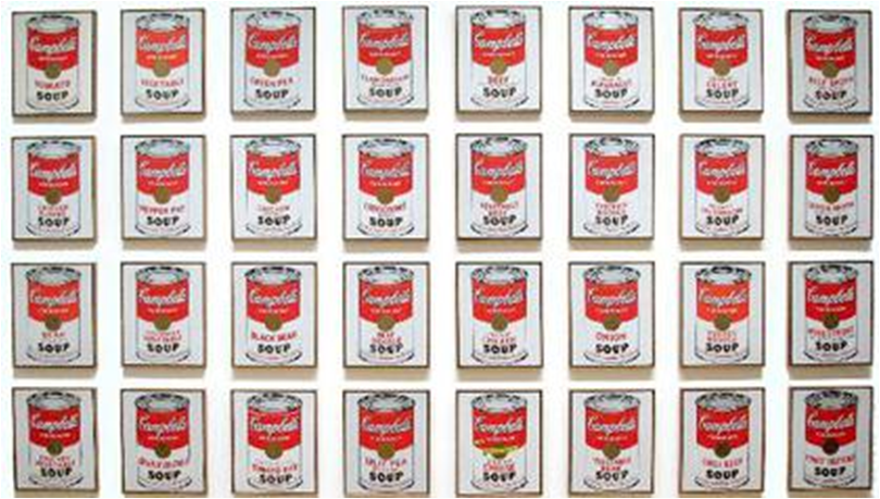
Campbell’s Soup Cans by Andy Warhol, 1962.
This work consists of thirty-two canvases, each measuring 20 inches (51 cm) in height × 16 inches (41 cm) in width and each consisting of a painting of a Campbell’s Soup can. This is an example of how he presented everyday objects as work of art- art devoid of higher purpose. It was during the 1960s that Warhol began to make paintings of iconic American objects such as dollar bills, mushroom clouds, electric chairs, Campbell’s Soup Cans, Coca-Cola bottles, celebrities such as Marilyn Monroe, Elvis Presley, Marlon Brando, Troy Donahue, Muhammad Ali, and Elizabeth Taylor, as well as newspaper headlines or photographs of police dogs attacking civil rights protesters. During these years, he founded his studio, “The Factory” and gathered about him a wide range of artists, writers, musicians, and underground celebrities.
Green Coca-Cola Bottles by Andy Warhol
“What’s great about this country is that America started the tradition where the richest consumers buy essentially the same things as the poorest. You can be watching TV and see Coca-Cola, and you know that the President drinks Coca-Cola and just think, you can drink Coca-Cola, too. A Coke is a Coke and no amount of money can get you a better Coke than the one the bum on the corner is drinking. All the Cokes are the same and all the Cokes are good. The President knows it, the bum knows it, and you know it.“
Paul Rand (1914-1996) was an American art director and graphic designer, best known for his corporate logo designs, including the logos for IBM, Westinghouse, ABC etc. He was one of the first American commercial artists to embrace and practice the Swiss Style of graphic design. His work has been identified as possessing “an explicit straightness” – urbane, stylish and with a bright and witty humour. Rand epitomized the optimism of good design and believed that the world could be improved by what he called “the designer’s art”. He was a key figure in the reception of modernism in American design.
“Visual communication of any kind … should be seen as the embodiment of form and function: the integration of the beautiful and the useful.”- Paul Rand
Rather than looking to a strict lineage of graphic design, he was inspired by fine art, drawing on the ideas of colour, texture and collage in the work of modern painters. Rand point out that “ideas do not need to be esoteric to be original or exciting.”
‘Westinghouse’ logo — Paul Rand 1959
His Westinghouse trademark, proves that a logo “cannot survive unless it is designed with the utmost simplicity and restraint.” The logo is meant to resemble a circuit board, of course, relevant to the client. Rand has made it look like a dot to dot, joining the dots on the circuit to finally make the ‘W’ where he then uses on the brands logo.
IBM logo by Rand- 1972
Rand also made use of graphic motifs as mnemonic (which assists in remembering something) devices. Stripes, were applied to the corporate identity for IBM. Eventually stripes became a metaphor for computers through which the public could remember the company, to the extent that in some versions the letters “IBM” do not appear.
Eye Bee M poster designed by Rand in 1981 for IBM.
Rand worked on IBM’s corporate identity for many years. One of his most ingenious logos for the business-machinery giant is based on visual representations of “eye“ and “bee”, combined with the “M” of the already familiar three-letter logo. IBM is said to have been initially reserved about the potential subversion of its identity through such graphic playfulness.
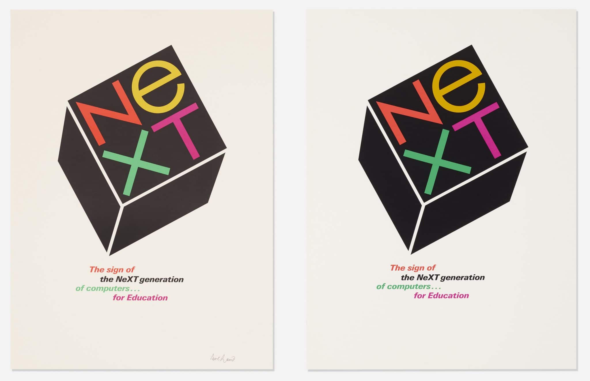
Pop Art was another reference in the identity that Rand created for NeXT Company.
Simplicity is not the goal. It is the by-product of a good idea and modest expectations.”– Paul Rand
“I haven’t changed my mind about modernism from the first day I ever did it…. It means integrity; it means honesty; it means the absence of sentimentality and the absence of nostalgia; it means simplicity; it means clarity. That’s what modernism means to me…” – Paul Rand
Saul Bass (1920- 1996) was an American graphic designer and Academy Award-winning filmmaker, best known for his design of motion-picture title sequences, film posters, and corporate logos. he has worked with Otto Preminger and Alfred Hitchcock on influential film title sequences. Saul Bass extended the boundaries of graphic design in the mid-twentieth century by devising a new approach to the packaging and marketing of films. In discovering parallels between the visual identity of film and other industrial products, he permanently changed the character of promotion, while also giving the films he worked on a strong and memorable form. One distinctive feature was the reduction of graphic elements to a minimum, as with the simple paper cut-outs used in The Man with the Golden Arm (1955) and Anatomy of a Murder (1959).
Before Bass’s seminal poster for The Man with the Golden Arm (1955), movie posters were dominated by depictions of key scenes or characters from the film, often both juxtaposed with each other. This was Bass’s earliest film poster to use torn paper, here mixed with action shots of the stars. The jagged arm, used on a range of posters and press advertisements, became a powerful visual symbol for the film. Bass’s posters, however, typically developed simplified, symbolic designs that visually communicated key essential elements of the film.
Poster for the movie- Anatomy of a Murder
Logos designed by Saul Bass. From top left: Bell System, AT&T, General Foods, United Airlines, Avery International, Continental Airlines, Celanese, United Way, Rockwell International, Minolta, Girl Scouts of the USA, Lawry’s Foods, Quaker Oats, Kleenex, Frontier Airlines, Dixie, Warner Communications, and Fuller Paints
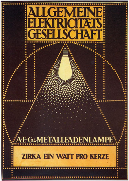
Peter Behrens (1868- 1940) was a German architect and designer. He is considered the first industrial designer in history. He designed the entire corporate identity (logotype, product design, publicity, etc.) for AEG company. He was very important to the modernist movement, and several of the movement’s leading names (including Ludwig Mies van der Rohe, Le Corbusier and Walter Gropius) worked for him in earlier stages of their careers.
In the field of graphic design Behrens was most important for his early Symbolist prints published in small art journals, his typeface designs and his work for the Berlin electrical manufacturer AEG. In 1907 Behrens was appointed artistic director to AEG, a major manufacturer of generators, cables, light bulbs, arc lamps and other electrical goods for domestic and industrial use. This was among the most celebrated appointments in design history, as it heralded the birth of the corporate identity. The classicism of Behrens’s designs, with their striking use of symmetry, geometry and strong black and white contrasts, was praised for giving AEG a look which was artistic yet rational.
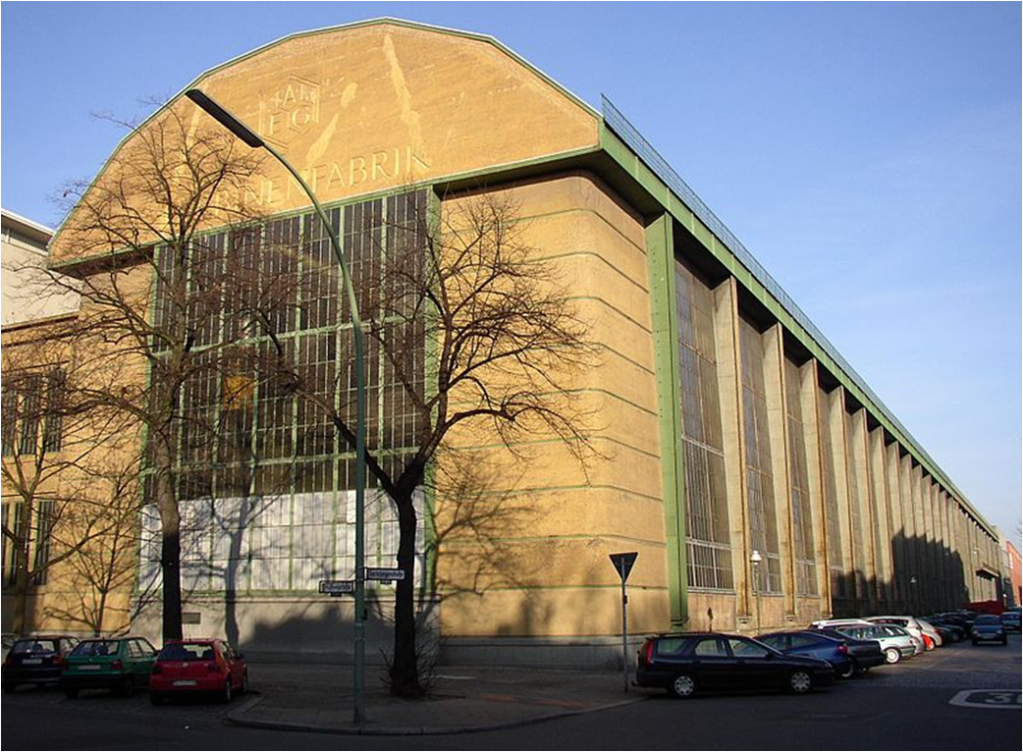
The AEG turbine factory was built around 1909. It is an influential and well-known example of industrial architecture. Its revolutionary design features 100m long and 15m tall glass and steel walls on either side. It was a bold move and world first that would have a durable impact on architecture as a whole.
This is Peter Behren’s way of Advertising the new product of AEG, an advanced lamp. This poster was created in 1910.
In the belief that, with the turn of the century, the arts were in need of regeneration, German type foundries commissioned Behrens to design typefaces which would express the new spirit of the age. It was also hoped that these might help put German industry on a competitive footing with France. Controversially, against the German tradition of setting texts in Gothic script, Behrens was keen to base designs on roman typefaces. Behrens-Antiqua was available in 1908. The latter, a “roman in a German spirit”, was used extensively in Behrens’s designs for AEG.
Peter Behrens, advertising stamps for AEG, 1910s. Berlin.
New logo for AEG by Peter Behrens in 1907 and other Behrens’s posters