
This post is intended to give a brief introduction about the History of Graphic Design. It is commonly observed that stylistic trends are cyclical, and studying the past can inspire some innovative ideas in the present, and also help us understand our roots. History of Visual Communication has been a long journey from stone tools to digital tablets, evolving through centuries. However the term graphic design was coined only in 1922 by William Addison Dwiggins, a book designer, to describe exactly what his role was in structuring and managing the visuals in book design.
Graphic Design before printing press
The roots of visual communication stretch all the way back to the times humanity lived in caves, probably as old as 38000 BCE. Humans have always had an inherent drive towards art, evidenced by the early cave paintings dating back to prehistoric times. Subjects vary from animals to hand imprints to events like hunting, and they’ve been found all over the world including India. The cave paintings are a proof that right from the start, humanity displayed an interest and skill for visual communication.

Our earliest languages were logographic—icons represented entire words instead of phonetic sounds. This suggests a natural ability of humans to use visual representation to communicate complex ideas, a cornerstone of modern graphic design. In a written language, a logogram or logograph is a written/ drawn character that represents a word or phrase.

China is known to have had the early printing discoveries, including non-papyrus paper making, woodblock printing, and movable type. China used wood reliefs to print and stamp designs on silk clothes as early as 200 CE,, and later it was done on paper too. They invented the world’s first movable type printing press out of porcelain, more than four centuries before Gutenburg brought a similar technology to Europe.
![Finely crafted books — like the medical work of 1249 shown above — were produced in China as early as the ninth century.[15]](https://upload.wikimedia.org/wikipedia/commons/thumb/4/41/Pen_ts%27ao%2C_woodblock_book_1249-ce.png/800px-Pen_ts%27ao%2C_woodblock_book_1249-ce.png)
In the Middle Ages, texts were produced and replicated by hand, and a little artistry made the books more valuable and set certain scholars apart from others. This could very well be seen in the medieval manuscripts of the Bible. In Islamic cultures, typography was doubly important because figurative art was seen as sacrilegious, meaning typography was one of only a few permissible ways of artistic expression.
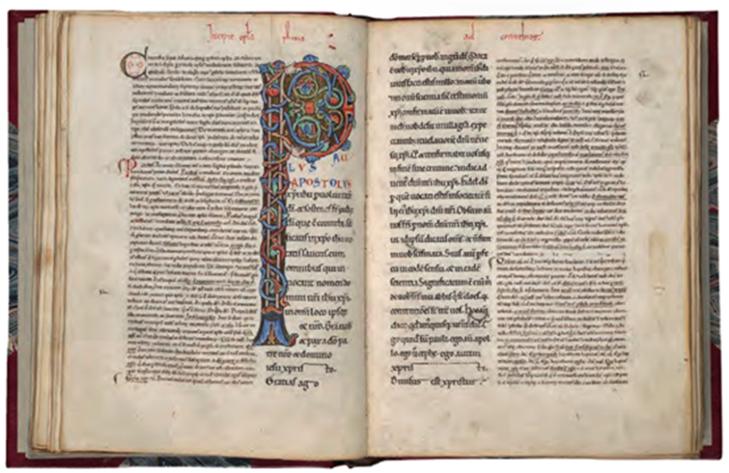
The scribal letter known as textur produced by the strong gothic spirit of blackletter from the hands of German area scribes, served as the model for the first text types.
Coat of arms, used as a symbol to represent family houses or territories in medieval Europe is considered as the oldest known logos. Scholars theorize the practice was popularized during the Crusades, where intermingling soldiers from different countries and houses figured out a means to tell everyone apart, particularly on armor and battle flags. Like logos, a house’s coat of arms aimed to represent the values, characteristics and styles of the people. Later, these emblems took on more practical purposes, such as wax seals to reflect authenticity.

The Renaissance Era
Johannes Gutenberg brought moveable type to Europe in 1439, introducing mass communication to Western culture and forever changing civilization. With the Gutenberg press, people no longer had to rely on lengthy scholarly reproductions of books, opening up literature (and literacy) to the masses and making it affordable. The Gutenberg press paved the way for more commercial uses of design, which ushered in the era of graphic design as we know it.
With the advent of the printing press in Europe, they were able to recreate text, art and design on a massive scale, and for relatively cheap. The ancestors of modern companies—also on the rise—soon took notice of how such visuals could affect shopping behaviors and increase profits, thus modern graphic design was born. Writing gave humanity a means of storing, retrieving, and documenting knowledge and information that transcended time and place; typographic printing allowed the economical and multiple production of alphabet communication. Knowledge spread rapidly, and literacy increased as a result of this remarkable invention.
Industrial Revolution
Industrial Revolution began in the mid- to late 1700s in England and spread to other countries in the 1800s. During this period, nations shifted from an agricultural to a manufacturing base. Cities became heavily populated and the consumer base began to increase. A spirit of innovation and progress gave rise to a new interest in providing information to an entire culture rather than only to an affluent elite. The growth of population centers, industry, and a money-based economy all increased the need for the dissemination of information. Advertising flourished during this exciting time, and great strides were made in printing.
The first photographic metal engraving was invented in 1824; the first halftone screen was made in 1852. A halftone screen is a pattern of dots of different sizes used to simulate and print a continuous-tone image in color or black and white. The first automated steam press for lithography was designed around 1868.
Technological advancements continued to fuel the progression of graphic design, such as the ability to print in color, or chromolithography. While used primarily for recreating paintings for home decor, chromolithography also opened new doors for advertising. Chromolithography enabled some degree of realism, allowing advertising to capitalize on attractive models, fashions of the day and artistic usage of colors.

As a response to Industrial revolution there was an emergence of advertising. Each company and product needed exposure to sell these manufactured products to the mass market — no earlier method of promotion could communicate to this number of people.
In addition to its new role in promoting products to the mass market, graphic design moved forward with an explosion of new font designs as well as new production methods. The design of fonts had earlier been linked to the practicaland cultural objectives of producing books and broadsheets. With large format posters and numerous other print components, text needed to do much more than represent a phonetic symbol. And thousands of new fonts emerged to meet the demand of the marketplace.
In addition to font development, the Industrial Age also contributed the photograph and ultimately its use in books and advertising. Numerous inventors searched for ways to integrate photography into the press process since the early years of its development in the 1830s. Photo engraving eventually arrived in 1871 using negatives and plates.
The Victorian Era
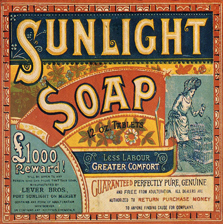
The Victorian era is often defined as the years from 1837 to 1901, Queen Victoria’s period in office. It was during the Victorian era that the full effects of industrialization made itself felt. Along with technological breakthroughs, the Industrial Revolution brought crime, urban poverty, and the rise of a self-indulgent newly rich class. Wealth became a motivating cultural force. As the desire for unlimited comfort spread from the wealthy to the new middle class, a taste for ornamentation and ostentation became the dominant style.
Extravagant embellishment was applied to architecture, furniture, clothing, and appeared as elaborate borders and lettering in graphic design. Sentimentality, nostalgia, and idealized beauty were expressed through printed images of young women, flowers, children, and puppies and kittens. Victorian commercial printed matter was characterized by the era’s pervasive ornamentation and careless craftsmanship. If a compositor lacked a lower-case g, for example, he would not hesitate to use an upside-down b in its place.
Typical design elements of early Victorian style were the use of outer decorative borders and elaborate typography. Symmetry was also used heavily in layout and design. The Victorian design style almost always filled the entire page with images and type. Typography through the Victorian era generally appeared in a curve or wave and was commonly encompassed in a banner.
Arts & Crafts Movement
The Arts and Crafts movement was an international movement in decorative and fine arts that began in Britain. It began as a reaction to the poor aesthetic quality of the Industrial Revolution in Great Britain. It stood for traditional craftsmanship using simple forms, and often featured medieval, romantic, or folk styles of decoration with heavy use of textures and illustrated initials.
Arts & Crafts advocated economic and social reform and was essentially anti-industrial. The art movement to react to the upheavels brought about by Industrial revolution was all about emotion, nostalgic, and focused on the wild beauty of nature, the rugged, remote places, and the exotic. It had a strong influence on the arts in Europe until it was replaced by Art Nouveau and Art Deco before being eventually displaced by Modernism in the 1930s.
The movement’s figurehead was William Morris (1834–1896), designer, typographer, printer, and publisher. Morris and friends advocated a return of art to craft in the manmade environment. His small printing company, Kelmscott Press, produced 53 books of superb quality and refinement. Morris inspired book and type designers to work with private presses who were more receptive to experimentation. William Morris advocated production by traditional craft methods. He insisted that the artist should be a craftsman-designer working by hand and advocated a society of free craftspeople, which he believed had existed during the Middle Ages.

Art Nouveau
Art Nouveau is a style of decorative art, architecture, and design prominent in western Europe and the USA from about 1890 until about 1920 and was characterised by intricate linear designs and flowing curves based on natural forms and an ‘earthy’ colour palette. It was inspired by natural forms and structures, particularly the curved lines of plants and flowers. Its key features are- intricate hand drawn style, linear based designs, use of natural forms and regularly featured female form.
These identifiable flat, outlined illustrations and hand-drawn typefaces leads to Art Nouveau sometimes being confused with Art Deco, but there is a clear distinction between the two. Art Nouveau looks hand drawn and prefers natural lines and shapes to the highly geometric shapes that define the Art Deco style.
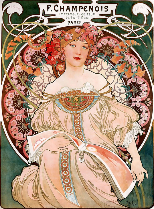
Techniqu: chromolithograph
Art Deco
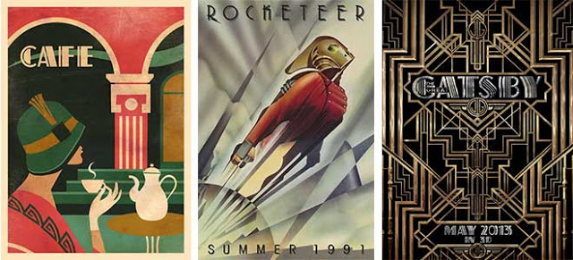
Art Deco had it’s heyday in the 1920’s and 30’s but, as a term, it was not coined until 1925. Art Deco uses sharp, aero-dynamic shapes, Egyptian zigzags, motion lines and, in more modern times, an airbrushed / grainy look. Art Deco’s pursuit of beauty in all aspects of life was directly reflective of the relative newness and mass usage of machine-age technology rather than traditional crafting methods to produce many objects.
These images are defined by geometric shapes, bold curves, strong vertical lines, aerodynamic forms, motion lines, airbrushing and sunbursts Unlike the Early Modern style, Art Deco highly exercises its use of illustrations and graphic representations of everyday objects. The main characteristics of the Art Deco graphic design style are- bold geometric shapes, use of motion lines and sunbursts, high contrast in colours and flat treatment (in terms of depth).
Plakatstil
Plakatstil , also known as “poster style”, was an early style of poster art that originated in Germany in the 1900s. The common characteristics of this style are bold eye-catching lettering with flat colors. Shapes and objects are simplified, and the composition focuses on a central object. Plakatstil turned away from the complexity of Art Nouveau and propagated a more modern outlook on poster art. Cut pieces of paper were moved around, changed, and pasted into position on board. The resulting style of absolutely flat planes of color had sensitive edges “drawn” with scissors

Modernist movements
Modernism was a revolt against the conservative values of realism. Modernists believed that each new generation must build on past styles in new way or break with the past in order to make the next major contribution. Modernism is associated with innovation and progress. Many modernists believed that by rejecting tradition and embracing new technology they could invent new ways of making art. The main characteristics of the Early Modern graphic design style are- geometrically based, minimalistic approach, clean type, use of more photos and less illustrations.
A few of the avant garde art movements that influenced Graphic design during this stage were:
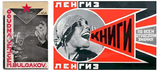
Supermatism: an art movement, focused on basic geometric forms, such as circles, squares, lines, and rectangles, painted in a limited range of colors. The term suprematism refers to an abstract art based upon “the supremacy of pure artistic feeling” rather than on visual depiction of objects

Dadaism: a movement consisted of artists who rejected the logic, reason, and aestheticism of modern capitalist society, instead expressing nonsense, irrationality, and anti-bourgeois protest in their works. Dadaism was not a style of art like Fauvism or Cubism. It was a form of artistic anarchy born out of disgust for the social, political and cultural establishment of the time which it held responsible for Europe’s descent into World War. They bitterly rebelled against the horrors of war, the decadence of European society, the shallowness of blind faith in technological progress, and the inadequacy of religion and conventional moral codes in a continent in upheaval. Rejecting all tradition, they sought complete freedom.

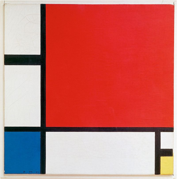
De Stijl: a reaction against the over-decorative Art Deco style, De Stijl artists eliminated representation in an abstract, pared-down aesthetic which worked in a visual language of geometric forms and primary colors.
Bauhaus
Following the Arts and Crafts ethos to unite fine and applied arts, creativity and manufacturing, art and industrial design, the movement put equal store in form and function, and set out to reduce decoration and frills, to rejuvenate design for everyday life. Fine art and craft were brought together with the goal of problem solving for a modern industrial society. In so doing, the Bauhaus effectively leveled the old hierarchy of the arts, placing crafts on par with fine arts such as sculpture and painting, and paving the way for many of the ideas that have inspired artists in the late 20th century
The Bauhaus school was founded by Walter Gropius in Germany, with the idea of creating a ‘total’ work of art in which all arts, including architecture would eventually be brought together. The Bauhaus style became one of the most influential currents in modern architecture and modern design.
Expressionism, Dadaism, Constructivism, and de Stijl influenced the Bauhaus faculty and students. It’s weavers, furniture designers, and metal smiths did not try to create works of art but rather good and useful designs in which form was tied to function. Graphic design faculty also emphasized clean functional design. The profession of industrial designer was born from this movement. Bauhaus publications featured asymmetry, a rectangular grid structure and sans-serif type.

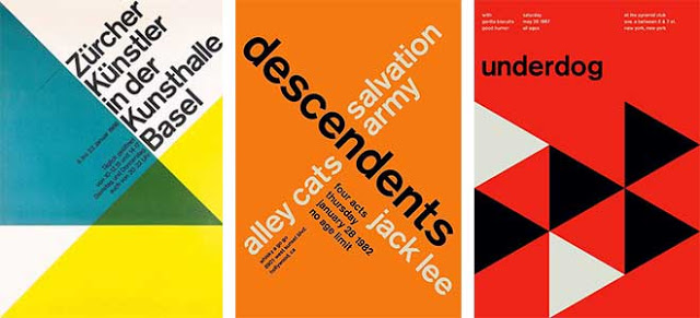
Swiss/ International Typographic Style
Often referred to as the International Typographic Style or the International Style, the style of design that originated in Switzerland in the 1940swas the basis of much of the development of graphic design during the mid to late 20th century. Led by designers at the Zurich School of Arts and Krafts and the Basel School of Design, the style favoured simplicity, legibility and objectivity.
The visual characteristics of this style include-
a. unity of design achieved by asymmetrical organization of the design elements on a mathematically constructed grid;
b.objective photography and copy that present visual and verbal information in a clear and factual manner, free from the exaggerated claims of propaganda and commercial advertising; and
c. the use of sans-serif typography set in a flush-left and raggedright margin configuration. The initiators of this movement believed sans-serif typography expressed the spirit of a more progressive age and that mathematical grids are the most legible and harmonious means for structuring information.
The main contributions were the use of, sans-serif typography, grids and asymmetrical layouts. Also stressed was the combination of typography and photography as a means of visual communication. The primary influential works were developed as posters, which were seen to be the most effective means of communication. The main characteristics of the International graphic design style are- use of negative space, very ‘clean’ and simple, use of sans serif fonts and asymmetrical layouts.
Post-Modern movements
Graphic design in the postmodern age brought forth ideas that challenged the orderly feel of modernism. Graphic designers created works beginning in the 1970s without any set adherence to rational order and formal organization.
Designers began experimenting with how shapes, forms and typography could react with one another effectively and interestingly in a less rigid way even if the design was rendered illegible. Some graphic design styles that emerged in the postmodernist era were New Wave Typography, retro and vernacular design, playful design inspired by the Italian Memphis Group, punk rock styles and explorative digital design from the late 1980’s.
It questioned the modernist ideal of a permanent, universally valid aesthetic. It encouraged the production of visually rich and complex designs, believing that there is more to design than the clear, impartial transmission of information. The main characteristics of the Post Modern graphic design style are- collage like illustrations, overlapping elements, impulsive and playful, tilted axis etc.

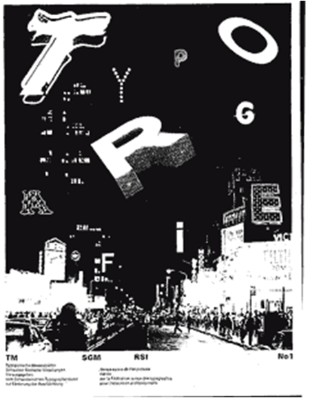
New wave Typography
New Wave or Swiss Punk Typography- a post modern movement- refers to an approach to typography that defies strict grid-based arrangement conventions. Characteristics include inconsistent letter spacing, varying type weights within single words and type set at non-right angles. The break from the grid structure meant that type could be set center, ragged left, ragged right, or chaotic.
Punk
It was part of the Postmodernist movement which began as a reaction to the rigid restrictions of Modernism. The main aesthetic of punk visual art seems to be to either shock, create a sense of empathy or revulsion, make a grand point with an acidic or sarcastic wit. One characteristic associated with punk art is the usage of letters cut out from newspapers and magazines.

Pop Art
Pop (popular) artists used familiar objects from popular culture as antithesis of traditional “high art” to protest against traditional themes of morality, religion, and history. They used mass-produced commercial items and tasteless advertisement materials as art objects celebrating them as fine art.

The digital era
The use of electronic technology has revolutionized design. Style and content are affected by the technology used in their creation. Computer graphics dates back to 1953. Although its early development was tied to defense and aerospace, computer graphics now has a wide variety of applications, from engineering, medicine, and geology to graphic design, animation, the film industry, and the Internet. The digital desktop has come a long way since the Macintosh was introduced in the mid-1980s. Adobe Photoshop—first released in 1990—even on its own changed the face of graphic design. Photo manipulation created a whole new subcategory of graphic design, blending together elements of photography, illustration, and CGI (Computer-generated imagery )
The Internet offers not only interactivity but also freedom from the physical constraints of traditional media. The Internet has become a vehicle for marketing products and disseminating information of all kinds. Our ability to communicate with interactive visuals and to create desktop video and 3- D animation is also developing a new market for graphic designers. Virtual reality is another developing technology. It extends the senses, allowing a person to move through and interact with a computer-simulated environment. The progression of visual communication from cave paintings to digital software can serve as great inspiration, but what fruit that bears is up to you, whose vision might lend itself to a new leap in design thinking.
References:
https://dylanspiteri.weebly.com/
https://www.onlinedesignteacher.com/
http://www.designishistory.com
http://www.historygraphicdesign.com

You may comment here, once you are done with the reading
LikeLiked by 12 people
Done.
LikeLike
Done
LikeLike
DONE
LikeLike
Done
LikeLike
Sir , new wave typographyde headingil different colors use cheythath purposefully anno sir?
LikeLike
😀alla.. that was accidental!
LikeLiked by 1 person
Done
LikeLike
DONE
LikeLike
Done!
LikeLike
Art Nouveau is a style of decorative art.
LikeLike
done
LikeLike
done
LikeLike
done
LikeLike
Done!..
LikeLiked by 1 person
Done
LikeLike
Done
LikeLike
DONE🤘🏽
LikeLike
done ❤
LikeLike
Done 😊
LikeLike
DONE
LikeLike
Done
LikeLike
DONE✌
LikeLike
Done
LikeLike
Done.
LikeLike
Done
LikeLike